
UI UX Design to Code: 7 Proven Services That Convert
A stunning UI/UX design is only as impactful as the code that brings it to life. You can spend tens of thousands of dollars hiring a premier design agency to craft a beautiful, high-fidelity Figma prototype, but if the development team botches the execution, that investment is entirely wasted. In modern web development, there is a notoriously frustrating disconnect—the "handoff gap"—between a designer's creative vision and the final digital product. When designs are handed over to inexperienced developers or outsourced to budget coding farms, the results are deeply disappointing. Complex animations fail to trigger, carefully calculated typography scaling completely breaks on mobile devices, custom grid systems are lazily replaced with generic Bootstrap templates, and messy, bloated underlying code destroys the page load speeds.
[toc]
UI UX Design to Code: 7 Proven Services That Convert
There is a moment in almost every web project where the design team and the development team look at the same screen and see completely different things.
The designer sees a layout that took weeks to refine — specific spacing values, a typography scale that was carefully calibrated, hover states that communicate intent, a grid system that creates visual rhythm. The developer sees a Figma file they need to turn into working code as quickly as possible.
When those two perspectives are not bridged properly, the result is a live product that looks approximately like the design. The spacing is slightly off. The mobile layout stacks in the wrong order. The animation that was supposed to feel smooth plays at the wrong speed. The font weight looks different in the browser than it did in the prototype.
These are not small problems. The gap between a design file and a live product is where brand quality gets lost — and where customers form their first impression of your business.
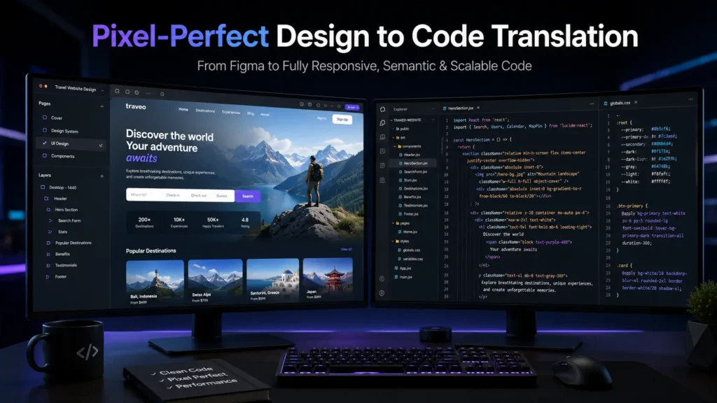
UI UX design to code is the discipline that closes that gap. It requires engineers who understand design systems, not just developers who can write CSS. At MarkupMarvel, we provide expert UI UX design to code services — translating Figma, Adobe XD, and Sketch files into semantic, high-performance frontends that match the approved design with the level of precision the original work deserves.
1. Why Automated Design to Code Tools Create More Problems Than They Solve
The appeal of automated conversion tools is obvious. Upload a Figma file, click export, get code. Tools like Anima, Webflow’s export function, and various AI-powered converters promise to eliminate the UI UX design to code handoff problem entirely.
In practice, they do not. They shift the problem downstream — into a codebase that is harder to work with, slower to load, and more expensive to maintain.
The code quality problem
Automated tools do not understand semantic structure. They do not know that a navigation element should be a <nav>, that a list of items should be <ul> and <li>, that a heading hierarchy matters for both accessibility and search engine indexing. They generate CSS with thousands of randomly named classes, deeply nested <div> structures, and inline styles that make the stylesheet nearly impossible to maintain.
The resulting code works in the narrow sense — it renders something that looks like the design in one browser at one screen size. But it is not maintainable, not accessible, and not built to be extended. Every future change requires working around the structure the tool generated rather than building on a clean foundation.
The responsiveness problem
Design files are static. The web is not. A Figma canvas does not tell an automated tool what should happen to a three-column layout when it is viewed on a 375px wide phone screen. Should the columns stack? Should one disappear? Should the typography scale down? Should the navigation collapse into a hamburger menu?
These are judgment calls that require understanding both the design intent and how browsers render content across different viewport sizes. Automated tools make generic guesses. The result looks fine at the exact dimensions the design was created for and breaks at most others.
The performance problem
Bloated CSS, redundant markup, unoptimized assets, and render-blocking scripts all contribute to slow page load times. Google’s Core Web Vitals measure this directly, and the scores from automated exports are consistently poor. A slow frontend does not just frustrate users — it damages search rankings and reduces conversion rates.
Manual UI UX design to code work produces none of these problems because the code is written by an engineer who understands what it needs to do, not generated by a tool that cannot.
2. Design Token Extraction and Pixel-Perfect Fidelity
Precision in UI UX design to code starts before any code is written. It starts with understanding the design system.
Before we open a code editor, we work through the Figma file systematically. We extract the global design tokens — the exact typography scale, the spacing system, the color palette with precise hex and HSL values, the border radius values, the shadow definitions, the grid column structure. We document these as CSS custom properties so that every value in the codebase traces back to a single source of truth.
This matters for maintainability. When a brand color changes, it changes in one place. When the spacing scale is adjusted, it propagates correctly through every component that uses it. Design tokens are not just a convenience — they are the structural foundation that keeps a large frontend codebase consistent over time.
With the design system documented, we work through every component and layout state. Every margin, every padding, every line height, every letter spacing is coded to match the specification exactly. Hover states, focus states, active states, disabled states — every interactive variation in the design is accounted for in the code.
We validate against the design file continuously during development, not just at the end. The standard we hold ourselves to in every UI UX design to code project: if it is in the Figma file, it is in the live product.
3. Fluid Responsive Architecture
Most responsive implementations handle two breakpoints — desktop and mobile — and leave the space in between to chance. Tablets get a desktop layout that is too wide. Large phones get a mobile layout that has too much empty space. Foldable devices and unconventional screen sizes get whatever the browser decides to do with a layout that was not designed for them.
We build responsive layouts that work across the full range of real-world screen sizes, not just the two most common ones.
The technical approach combines CSS Grid for two-dimensional layout control, Flexbox for component-level alignment, and modern CSS functions like clamp() for fluid typography that scales smoothly between defined minimum and maximum sizes without discrete jumps at breakpoints.
Custom micro-breakpoints are defined where the layout actually needs them — when a specific element starts to overflow, when a particular grid column arrangement stops working, when the navigation needs to change structure. These breakpoints are driven by the content and the design intent, not by arbitrary device category boundaries.
The result is a UI UX design to code output that handles ultra-wide 4K monitors, standard desktop viewports, tablets in both orientations, and mobile screens from small to large — without any of them feeling like an afterthought.
4. Micro-Interactions and Animation Engineering
A design file shows what a product looks like at rest. It cannot fully convey how it should feel in motion — the timing of a transition, the easing curve of an animation, the way a button responds to a hover, the sequence in which elements load onto the screen.
These details are not decoration. Motion communicates state changes, guides user attention, and creates the sense of responsiveness that distinguishes a polished product from one that feels static and cheap. Users cannot always articulate what makes one interface feel better than another, but they feel the difference.
We bridge the gap between a static design file and a product that feels alive.
For interface transitions and component animations, we use native CSS animations and transitions wherever the browser can handle them at 60fps without JavaScript involvement. CSS-driven animations are more performant and more battery-efficient than JavaScript alternatives for the majority of common UI patterns.
For complex, sequenced, or physics-based animations — page load sequences, scroll-triggered reveals, parallax effects, gesture-responsive motion — we use GSAP (GreenSock Animation Platform) or Framer Motion. Both libraries are optimized for browser performance and give us precise control over timing, easing, and sequencing.
Every animation we implement as part of our UI UX design to code process is tested across devices and connection speeds. An animation that runs smoothly on a flagship phone should also be acceptable on a mid-range device with a slower processor.
5. Component-Driven Development: React, Vue, and Next.js
For landing pages and marketing sites, a well-structured HTML and CSS codebase is sufficient. For web applications, dashboards, SaaS platforms, and any frontend that handles dynamic data and complex user interactions, a component-based JavaScript framework is the right architecture for UI UX design to code projects.
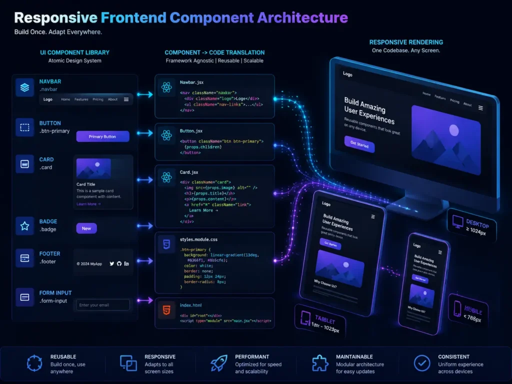
We apply Atomic Design principles to build frontends from the ground up as systems of reusable components.
In practice: a button is a component. A form field is a component. A data table, a navigation bar, a modal dialog, a notification toast — each is a self-contained piece of UI with its own markup, styles, and logic. These components are composed into larger patterns, which are composed into full page layouts.
The business value of this approach is compounding over time. When a design update changes the button style across the entire application, it changes in one component file. When a new page needs to be built, it is assembled from existing components rather than recoded from scratch. When the development team grows, new engineers can understand and work with the component library without reverse-engineering a monolithic stylesheet.
We build component libraries in React, Vue, or Next.js depending on the project requirements and the team’s existing infrastructure. For projects requiring server-side rendering for SEO — marketing sites, content-heavy pages, e-commerce — Next.js handles both the component architecture and the rendering strategy in one framework.
6. Semantic HTML, Accessibility, and Core Web Vitals
A frontend that looks correct is not necessarily built correctly. The structure of the HTML, the way content is organized for screen readers, and the performance characteristics of the page all affect how the product performs in the real world — for users with disabilities, for users on slow connections, and for search engine crawlers.
Semantic HTML structure
We write HTML that means something. Navigation elements use <nav>. Article content uses <article>. Headings follow a logical hierarchy from <h1> through <h6>. Lists use <ul> and <ol>. Buttons are <button> elements, not styled <div> tags wired up with JavaScript click handlers.
This matters for accessibility — screen readers use semantic structure to navigate content. It matters for SEO — search engines use heading hierarchy and semantic landmarks to understand page structure. And it matters for maintainability — code that is structured semantically is easier to understand and modify.
Accessibility (WCAG 2.1 AA)
We implement ARIA labels where native semantics are insufficient, ensure keyboard navigation works correctly through all interactive elements, validate color contrast ratios against WCAG 2.1 AA standards, and test with screen readers. Accessibility is built into the UI UX design to code process, not audited at the end.
Core Web Vitals
According to Google’s Web Vitals documentation, Largest Contentful Paint (LCP), Interaction to Next Paint (INP), and Cumulative Layout Shift (CLS) directly affect search rankings and user experience. Our builds consistently score above 90 on Google PageSpeed Insights for both mobile and desktop because performance is designed into the architecture — deferred JavaScript loading, next-gen image formats (WebP and AVIF), CSS minification, and critical CSS inlining are standard practices, not post-launch optimizations.
7. Design File Formats and CMS Integration
Our UI UX design to code services are not limited to a single design tool or a single output format.
Design file inputs we work with:
Figma is the current industry standard and our primary working environment. We also work with Adobe XD, Sketch, InVision, Zeplin, and layered Photoshop (PSD) files. Regardless of the source format, the UI UX design to code process is the same — systematic extraction of design tokens, component inventory, and state documentation before any code is written.
Output formats we deliver:
We deliver the coded frontend in whatever format your project requires. Clean, raw HTML, CSS, and JavaScript files for projects that will be integrated by your internal team. Structured React or Vue component libraries for projects connecting to an existing application. Full Next.js applications with server-side rendering configured. Or direct integration into a headless CMS like Sanity, Contentful, or Strapi, with the frontend wired to pull content from the CMS and render it through the component architecture.
We also integrate coded frontends into backend frameworks — Laravel, Node.js, and custom API backends. The frontend layer is built to be connected, not delivered as an isolated artifact that requires significant rework to integrate.
According to MDN Web Docs, proper semantic HTML structure is the single most impactful step a development team can take for both accessibility and search engine optimization — a principle that guides every UI UX design to code project we deliver.
Frequently Asked Questions
Q: Do you accept design files other than Figma?
Yes. Our UI UX design to code services work with Figma, Adobe XD, Sketch, InVision, Zeplin, and Photoshop PSD files. Figma is our preferred format because it has the most complete design token and component tooling, but we can extract what we need from any well-organized design file.
Q: Will the final coded product look exactly like the design?
Yes — that is the standard we hold ourselves to on every UI UX design to code project. We do not use pre-built themes or component libraries that force your design to conform to someone else’s structure. Every element is manually coded to match the approved design file, including typography, spacing, color, hover states, and responsive behavior.
Q: What if my design only has desktop mockups and no mobile screens?
We apply responsive design best practices to determine how each layout element should behave at smaller screen sizes. For complex or ambiguous cases, we flag them before development and align on the intended behavior rather than making assumptions that require rework later.
Q: Can you integrate the coded frontend into our existing backend or CMS?
Yes. We deliver code in the format your infrastructure requires — raw HTML/CSS/JS, React or Vue components, a Next.js application, or a directly integrated headless CMS or backend framework connection. Our UI UX design to code deliverables are built to connect, not handed off as static prototypes.
Q: How do you handle complex animations from the design?
We implement animations using native CSS transitions and keyframes where possible, and GSAP or Framer Motion for complex, sequenced, or scroll-triggered animations. Every animation is performance-tested across device types and adjusted if it creates frame drops on lower-powered devices.
Q: Do you build design systems and component libraries?
Yes. For larger products, we build a full component library using Atomic Design principles — atoms, molecules, organisms — that serves as the single source of truth for the frontend. This makes future UI UX design to code work faster and keeps visual consistency across the product as it grows.
Your Design Deserves Better Than an Approximation
A design that took weeks of careful work deserves to be built with the same level of precision. Automated tools and developers who treat Figma files as rough suggestions produce frontends that erode the value of the original design investment.
UI UX design to code done properly means every spacing value is exact, every animation timing is intentional, every component is reusable, and every breakpoint is considered. It means a live product that matches the approved design — not one that sort of resembles it.
MarkupMarvel delivers UI UX design to code services for brands that take the quality of their digital presence seriously.
Explore
Other Services We Provide

Website Migration Services: 5 Proven Steps to Zero Downtime
Migrating a live, revenue-generating website is one of the highest-stakes technical projects a business can...
Service Details →
Multi-Vendor Marketplace Development: 7 Proven Strategies
The traditional, single-seller e-commerce model is rapidly evolving. If you look at the most lucrative,...
Service Details →
The Ultimate 7-Step Technical SEO Setup Guide for B2B Growth
A beautiful website that nobody can find is not an asset; it is a liability....
Service Details →